Reed.co.uk - Jobseeker login experience
Redesign the log-in page to allow users register and sign in using social platforms.
A little intro to reed.co.uk
Reed is a top recruitment brand in the UK connecting jobseekers and employers via their own recruiter network as well as the reed.co.uk website and app. Thousands of jobseekers apply for roles every day.
I was part of reed’s B2C team that was responsible for managing the Jobseeker Profile and Registration. That was a really important part of the business as the data we captured was presented to the recruiters.

Project goal
The goal of the team was was to increase the number of successful registrations from 1.6% to 2% of the users entering the site without an account.
Our hypothesis
By providing a social sign-in option users it will make it easier for users to register and will therefore increase registration rates.
Project goal (ctd)
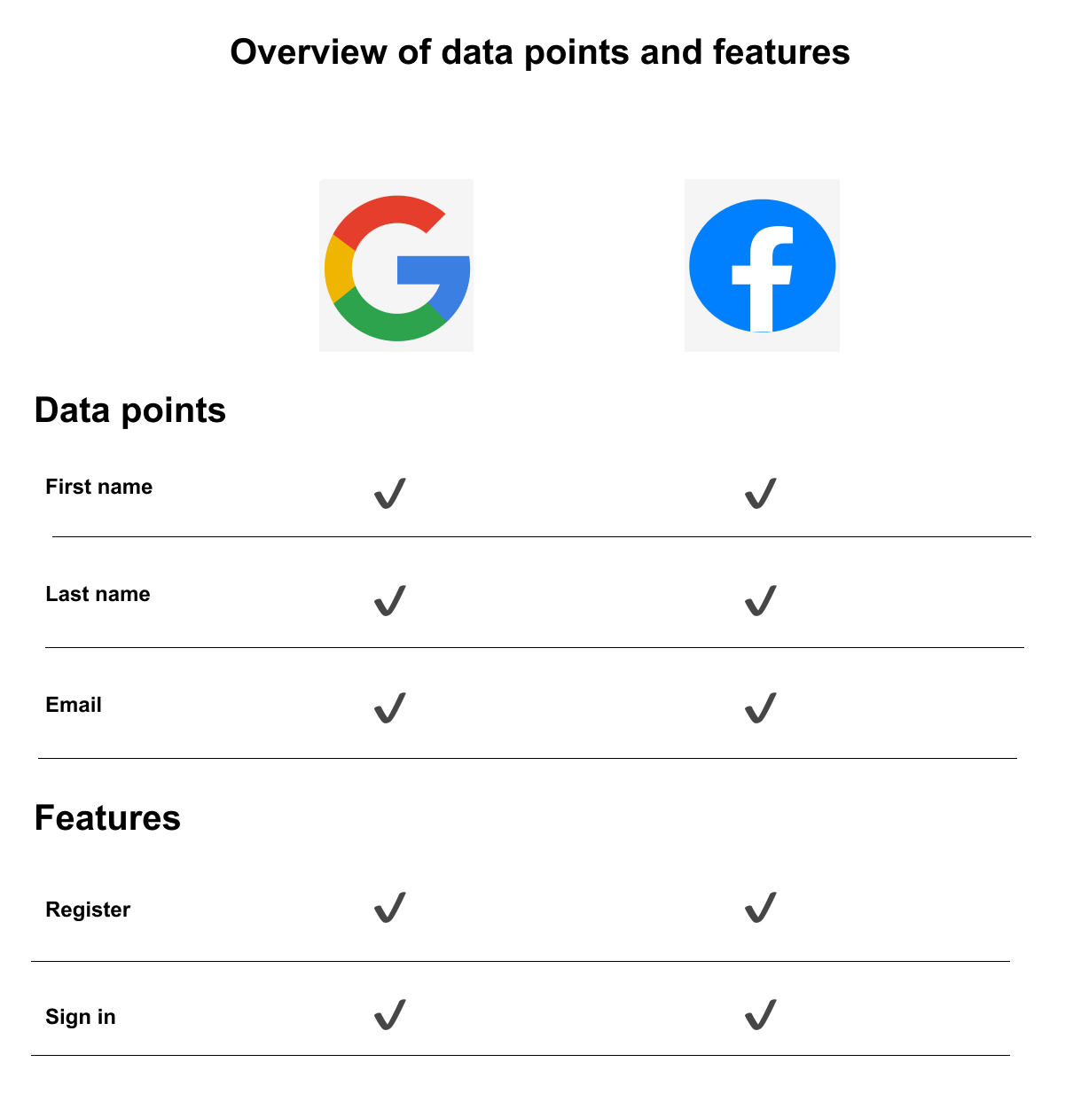
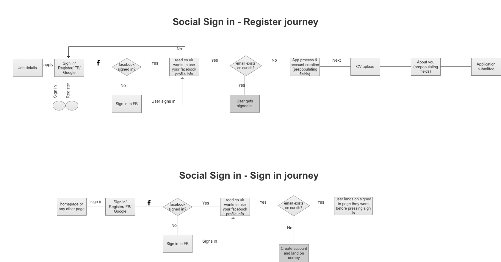
Users would be allowed to register on the jobseeker site using Facebook or Google, alongside the manual registration process. That would allow reed.co.uk to automatically retrieve certain fields such as first and last name, and email, from the social media platforms, making the registration process shorter and smoother.
Additionally, users could easier sign in to their accounts using their Facebook or Google profiles, without having to create a new password for reed.co.uk.
Other roles involved:
UI designer
Front-end and back-end developers
QA Tester
Product owner
Agile coach
Part 1 - Understand
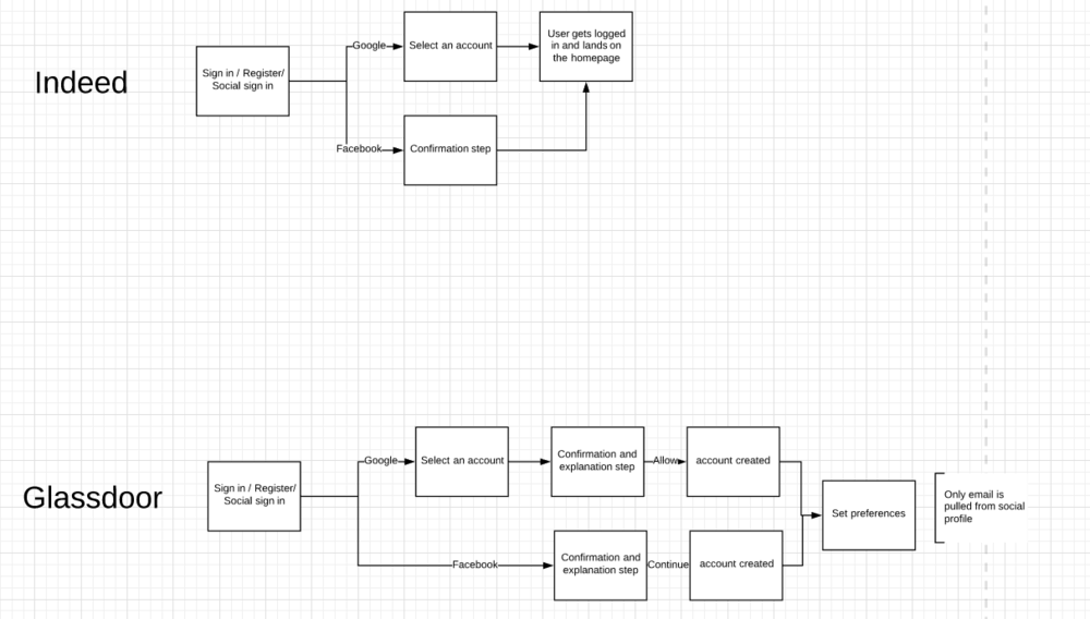
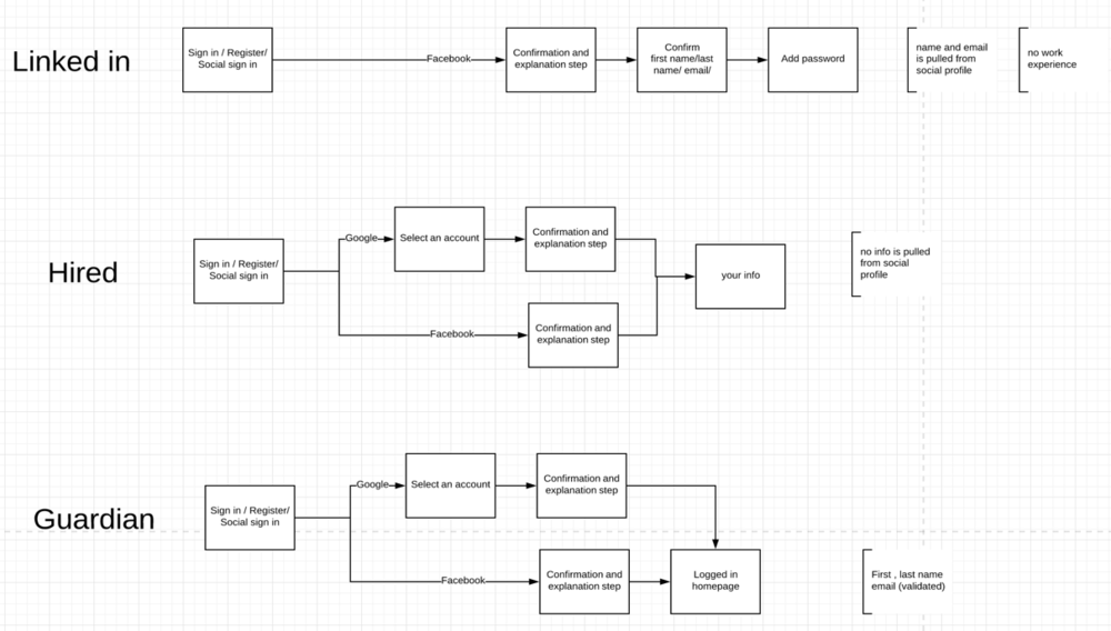
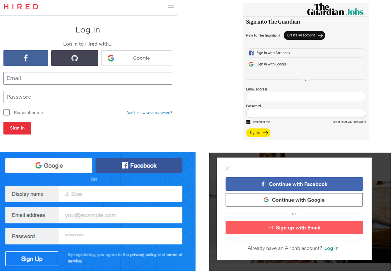
1. Competitor analysis
To begin with, I researched and documented the process of other popular websites that had already adopted this feature. I looked at the social sign-in journey on several competitor websites and noted the information retrieved from each user's social media profile. This helped me gather ideas and insights on how to approach and optimise our own social sign-in process.
The sites I reviewed were indeed, Glassdoor, linkedin, hired, Guardian jobs and others.
2. Analysis of the existing registration process at reed.co.uk
During my analysis, I discovered that there were two types of registration forms on the jobseeker site.
The first type was called "direct registration", which occurs when a user chooses to create an account themselves by clicking on a Register button.
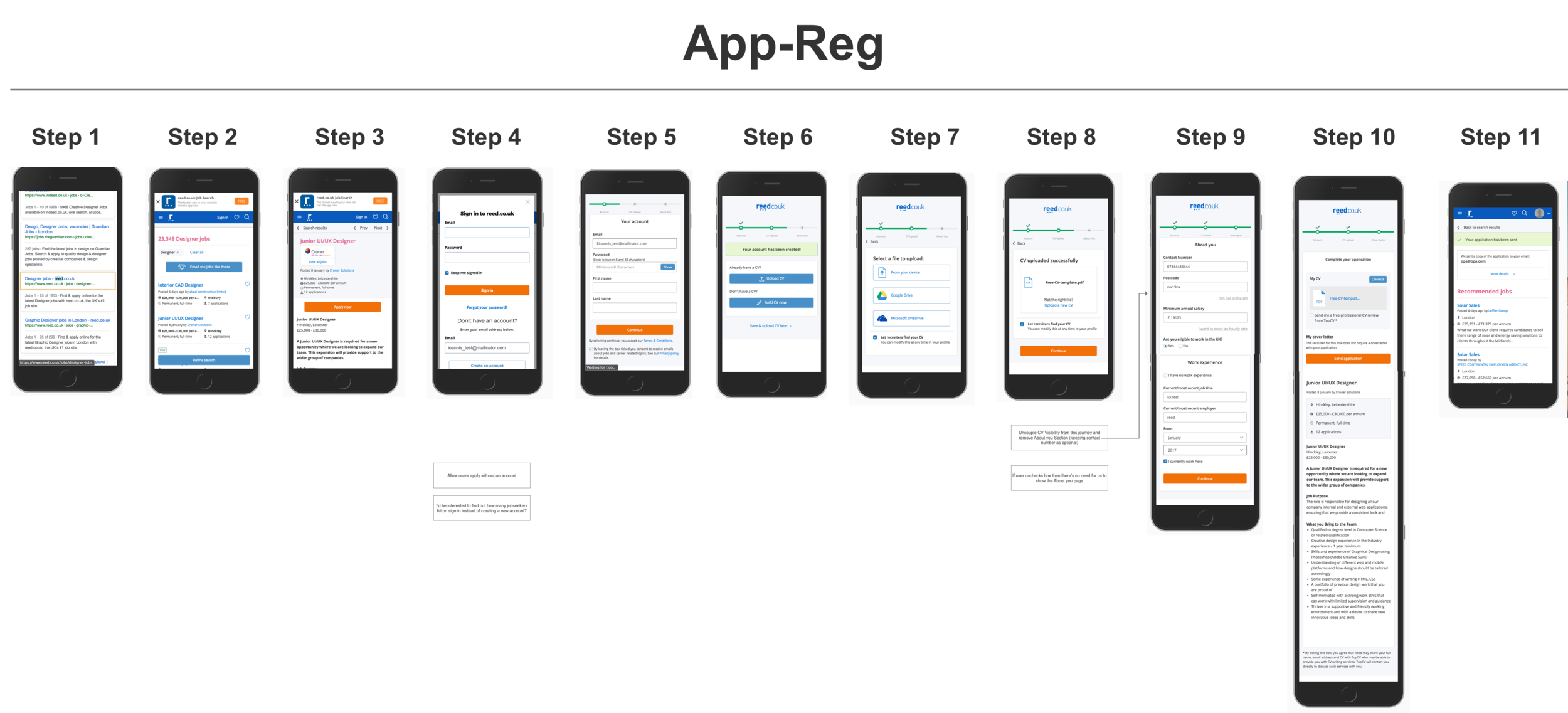
The second type, called "App-Reg", is triggered when a user attempts to apply for a job and the site asks them to create an account in order to complete their application. The App-Reg form asks for less information than the direct registration form, as some information can be inferred from the job the user is applying for.
Reviewing the information that we requested through registration was decided to be out of scope, as there was a separate piece underway to address this specific topic.
Part 2 - Design
New registration process flow
I focused on creating process flows and mapping out the user journey rather than focusing solely on individual screens. Through research of competitor user journeys, I was able to design an optimal user journey that aligned with the reed.co.uk App-Reg process.
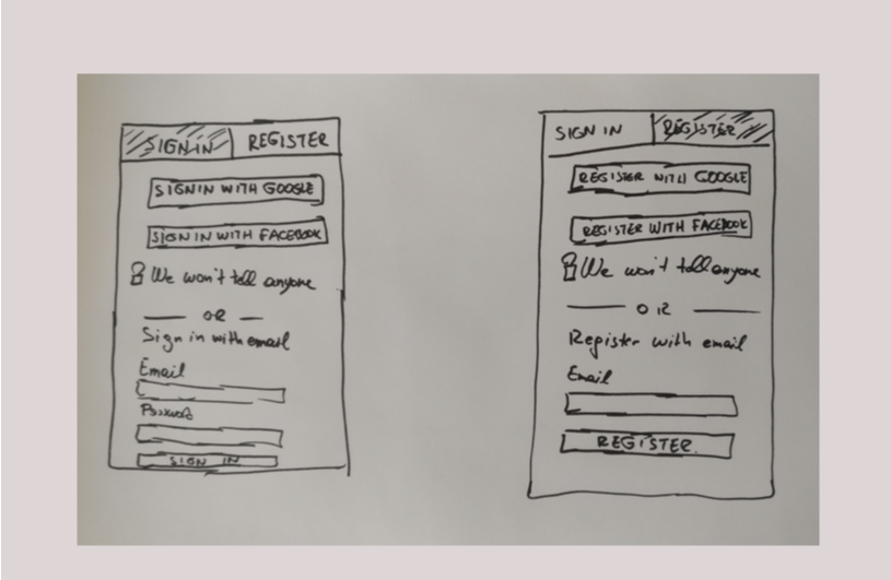
3. Sketches and wireframes for the new log-in page
As part of my analysis and design process I reviewed the current Sign-in/registration page and I identified several issues :
The registration section was given secondary importance on the form
Inconsistencies in the styling of the section headers ("Sign in" vs. "Don't have an account?")
On smaller devices with screen sizes less than 580 pixels, the registration section was not directly visible as it sat below the fold
The addition of social sign-in buttons would further shift the registration section down on the page
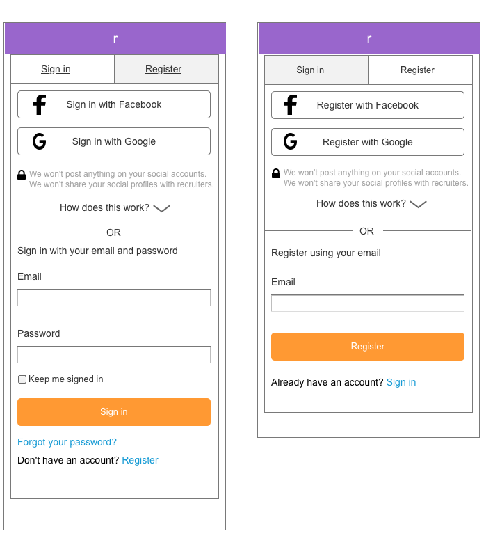
Taking these issues into consideration, I felt it was reasonable to redesign the login/registration page. I introduced two tabs at the top of the page to maintain balance between the two functions and clearly indicate which tab was active at any given time.
I then started sketching the new screen and shared the designs with the Product owner and the developer
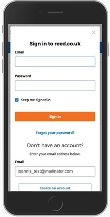
Previous Log-in/registration page
After receiving feedback from the team regarding the proposed solution, I moved forward with creating wireframes for the redesigned log-in/registration pages.
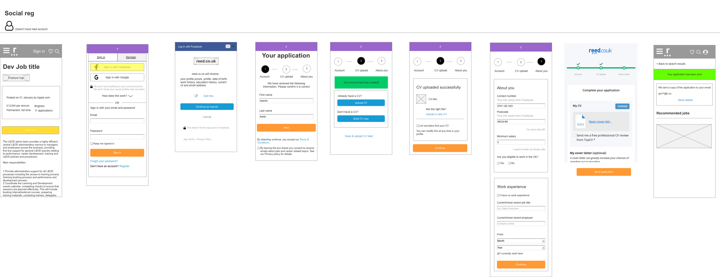
3. User journeys
After finalising the wireframes for the new login page, I stepped back and looked at the big picture to see how it fits with the entire new App-Reg user journey.
Part 3 - User feedback
1. Testing with colleagues
To gather feedback on the new user journey, I created an Axure prototype based on the wireframes and conducted a round of internal user testing. I involved 11 colleagues from different teams across the business, including the sales, customer experience, and account management teams who were not involved in the project.
2. Guerilla testing at Costa in Covent Garden
To gather additional feedback on the new App-Reg user journey, I conducted out-of-office testing with 6 external users at a Costa Coffee branch. Despite receiving mostly positive feedback, some aspects were unclear to users and required modifications.
I worked closely with the UI Designer in my team to address these issues and create the final UI specifications.
To ensure a smooth rollout, we released the new log-in page in stages. First, we separated the signing-in from the registration function by introducing tabs at the top. After monitoring user activity and the number of successful sign-ins and registrations for three weeks, we released the second increment, which included social sign-in options.
The social sign-in options have been well-received, with 15% of our users opting to use them. As a result, there has been a 15% increase in registrations.